Pre-diabetes Edu Test
Prediabetes education test is a vending machine UI to introduce customer about pre-diabetes and encourage them to make better diet decisions. We conducted research about pre-diabetes synthesize users behaviors into insights and design scenarios to inform people about this disease.
Roles
UX Designer
UI Designer
Deliverables
Prototype
Tools
Photoshop
After Effects
Adobe XD
Time
3 weeks


Understanding
What is pre-diabetes
Over time you could get non-reversible diabetes.
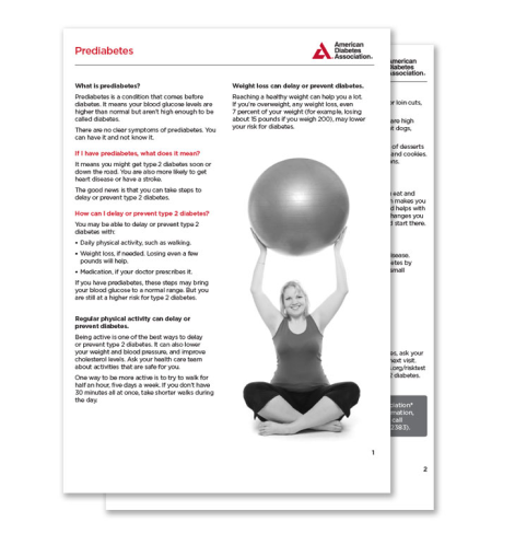
Early diagnoseing pre-diabetes is critical in diabetes treatment. Prediabetes is blood sugar higher than normal but not high enough yet to be diagnosed as type 2 diabetes. Type 2 diabetes, the most common type of diabetes, which means the body does not make or use insulin well, which can be diagnosed at any age and not reversible.
Climbing numbers
In 2015, around 9.4 percent in the U.S had diabetes.
Between 1990 and 2010, the number of people living with diabetes more than tripled, and the number of new cases doubled every year.
Research
Desk research
To be aware of prediabetes is hard.
The high-risk people are those who have relatives with diabetes, but they don't often pay much attention to the nutrition in their diet and don't care about prediabetes. The reasons as listed:
1. Prediabetes doesn't have obvious symptoms. Even patients have been diagnosed as prediabetes, they might not care.
2. To diagnose prediabetes, people need an A1C test, a blood test that provides information about the average levels of blood glucose over the past three months.
Interview
It's a treat for me. I feel good to have a snack around.
Diabetes is far from people's concern. Having a high sugar snack is a more or less pleasant experience.

College Student, Age 23, Working late in studio.
Interview insight
Feel tired-> Sugar to boost up-> Too many sugars cause fatigue-> More sugar. It’s a sugar-fatigue loop.
People get tired out of working and studying. It’s the moment they crave things to make them inspired. High-sugar food, like milk tea, Coke, snack bar, is the ideal choice.
But one 12 oz Coke has 39g sugar, which is already higher than recommended 38 grams for a man a day. The more sugar they have, the more amount they crave.
The experience needs to be delightful and exciting for exhausting people.
Rapid test
Sacrificed prototype
To break the sugar-fatigue loop, we aimed to give people a better choice.
To change people’s choice, we can use threaten by frightening people with horrible facts of diabetes, like smoking ads campaign, and we can nudge people to make decisions by reducing friction to getting it, like recreation parks around the corner. I developed three ideas that people can view their diet situation in a long-term view. People have an assistant to encourage them to have a better diet and get suggestions right before they make a purchase decision.
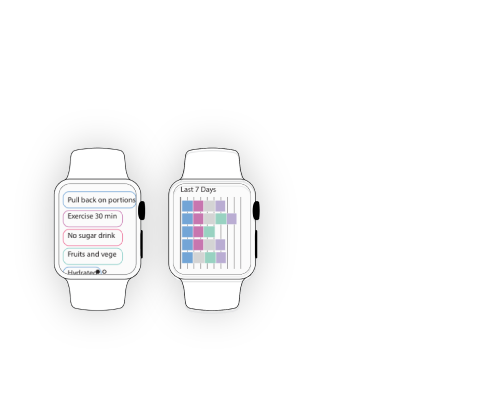
Tracking App
Collect the daily behavior, to view and change them in a longer time perspective.
Pro
-objective data for the reliable suggestion.
-long term effects
Con
-tedious log activities
-various input type
-long term investment with little progress
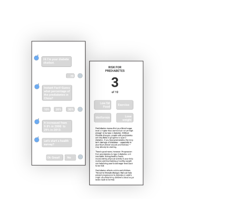
Health assistant
Discuss prediabetes with a personal chatbot. It gives you a brief diagnose of your health condition and suggestion.
Pro
-Q&A gets user attention
-flexible in any platform
-constantly reminding every day
-human touch or food suggestion
Con
-questions are too private
-hard to cover details and take action
-gradually annoying
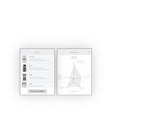
Vending machine
Inform customers about the nutrition facts of foods/drinks to help them make healthier food selection.
Pro
-instant positive affect
-potential user
-clear on cause and effect
Con
-a small group of user and context
-short term effect
Guerrilla test
Keeping health is a long term mission, but health application needs strong reasons to retain users with long term interest.
Informing users about their diet situation and providing better suggestions to the user seems like a useful help. But from the guerrilla test, I realized how little people would like to come back to the application to see the problem in diet and listen to the “convenient” suggestion.
Instead of sticking around the user with an application, I decided to focus on leaving a clear impression of prediabetes to the user and provide a better choice right at the decisive moment. Based on the previous test, users wish they could know the facts that 1/3 people have prediabetes, and prediabetes is reversible. I realized when the impressive effects have more connections to users, they are more likely to remember. Therefore, I focus on the task about how to build the links.

Ideation

Prediabetes self check questions
1 min questions to know your rate to get prediabetes.

The lower sugar, the lower price
Give rewards to customers shopping for lower sugar food.

Local average prediabetes rate
Team up the local and show average prediabetes rate.

Highlight impressive facts
Show the 1/3 percent rate and last chance to reverse.

Set goal for user to accomplish
The more healthy decision you made, the higher score you get.

Fast test challenge! Now start!
Let’s finish these True/False prediabetes questions.

Congratulate! You made it!
Celebrate the lower than average sugar consumption.
Narrowing down
Count the exceed sugar in the food user just bought then calculate the chance of them getting prediabetes.
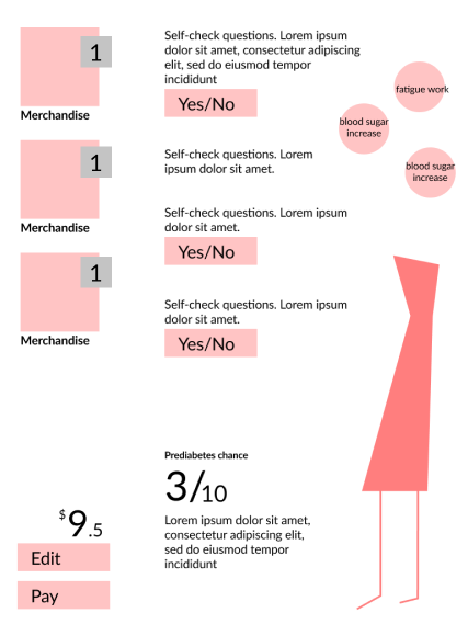
We use the self-check questions as a tool for the user to understand their risk of prediabetes. But it's too private for a quick test. We came up with the idea that we make it a character, like The Sims, to alienate users from the feeling of being surveillance or blamed, simulating users' decisions and showing the effects of different choices to inform them of better options.
Insights
Why should I answer the self-check questions. I don’t want to feel guilty for my pleasure.
“The questions are too private.” People don’t want to unveiled personal information to strangers or anomy.
“I just want to grab something to eat.” People go to the vending machine are in a hurry and look for a snack, something instant and fast.
“I know the high sugar, but I want it.” People might know diabetes, but don’t know how it affects life.
“How good and how bad I did?” People want positive feedback and a clear motivation.
Prototype
We built our low-fi prototype testing and tested it with multiple users based on our process and draft. Some essential feedback includes:
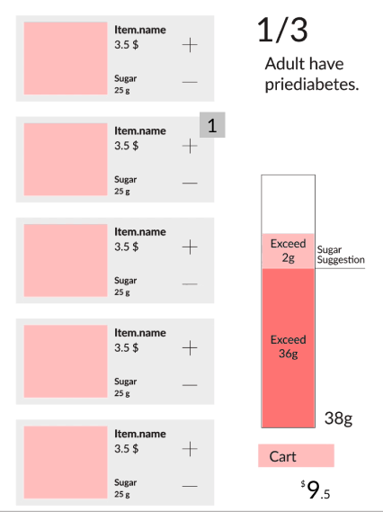
-Why I see 1/3 prediabetes while I am shopping
-I am not clear about which item added the most amount of sugar.
-There are too many words to remember.
-If there is no item, how to remind the user
High-fi
Then we revised our design based on the feedback gathered during low-fi prototype testing. Among the many iterations we made, there were three major design changes:
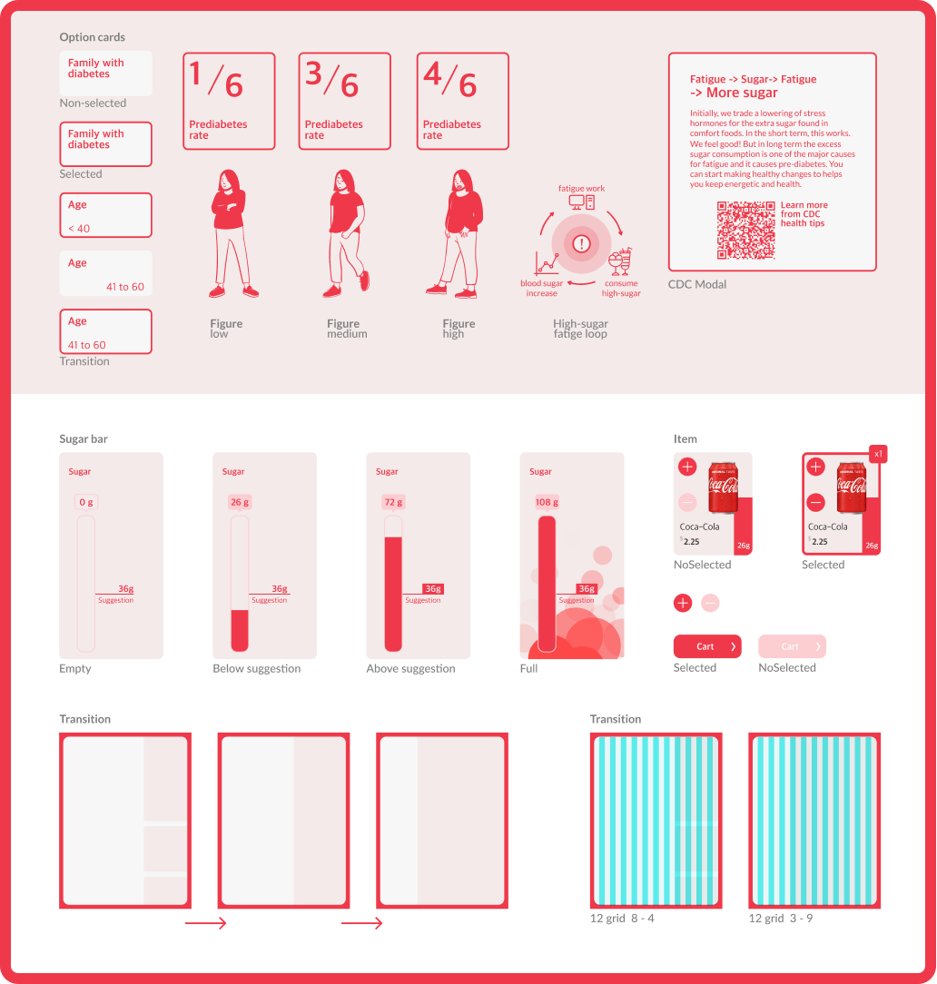
On the home screen, the prediabetes fact doesn’t have a relation to the vending process. We switch the sugar meter and fact to reduce the visual attention on the fact. The stroke number would be filled after the meter reaches the daily sugar suggestion.
We clarify the sugar amount with the indicator bar on each item. The bar height is the same as the height that will be added to the meter.
To quickly understanding the choice, we simplify the description to words. The option can be toggled to switch between options.
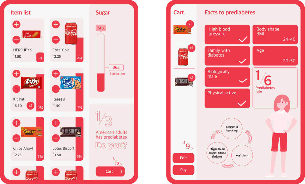
Before moving on to build our animated prototype, we conducted a heuristic evaluation on our high-fi prototype using the ten usability heuristics proposed by Jakob Nielsen. The usability problems identified and the corresponding changes we made in the high-fi prototype are summarized below.


